Exploratory analysis script by Marco Reina

# Loading libraries
library(readr)
library(here)
here() starts at C:/Users/marco/Documents/marcoreina-MADA-project
library(dplyr)

Attaching package: 'dplyr'
The following objects are masked from 'package:stats':

    filter, lag
The following objects are masked from 'package:base':

    intersect, setdiff, setequal, union
library(countries)
library(ggplot2)
library(tidyr)

INITIAL CODE: NOT EXECUTABLE. DO NOT RUN.

This code is provided only for disclosure purpuses, and to show how I started wrangling the original dataset. However, the raw data seems too big to ensure reproducibility. Smaller dataframes were created from the original raw data and the executable code will start from there. For my project, two databases are going to be explored and merged to characterize AMR in Salmonella.
The code to create the initial files is the following:
#Isolates obtained from _NCBI Pathogen Detection_ database: Salmonella
isolates_raw <- read_tsv(here("data/raw-data", "isolates.tsv"))

#Changing format from tsv to csv
write_csv(isolates_raw, here("data/raw-data/", "isolates0.csv"))

#Making a new object based on new csv
isolates0 <- read.csv(here("data/raw-data/", "isolates0.csv"))

#Genomes dataset from NCBI: _Bacterial genomes_
genomes_raw <- read_tsv(here("data/raw-data/", "genomes_datasets.tsv"))

#Changing format from tsv to csv
write_csv(genomes_raw, here("data/raw-data/", "genomes0.csv"))

#Making a new object based on new csv
genomes0 <- read.csv(here("data/raw-data/", "genomes0.csv"))

#Removing non useful columns from isolates0
isolates0$WGS.accession =   NULL
isolates0$WGS.prefix    =   NULL
isolates0$PFGE.secondary.enzyme.pattern =   NULL
isolates0$PFGE.primary.enzyme.pattern   =   NULL
isolates0$Platform  =   NULL
isolates0$Host.disease  =   NULL
isolates0$Outbreak  =   NULL
isolates0$SRA.release.date  =   NULL
isolates0$SRA.Center    =   NULL
isolates0$Run   =   NULL
isolates0$Library.layout    =   NULL
isolates0$Lat.Lon   =   NULL
isolates0$AST.phenotypes    =   NULL
isolates0$AMR.genotypes.core    =   NULL
isolates0$Host  =   NULL
isolates0$Min.same  =   NULL
isolates0$Min.diff  =   NULL

#Removing non-useful columns from genomes0
genomes0$Assembly.Paired.Assembly.Accession =   NULL
genomes0$Organism.Infraspecific.Names.Breed =   NULL
genomes0$Organism.Infraspecific.Names.Strain    =   NULL
genomes0$Organism.Infraspecific.Names.Cultivar  =   NULL
genomes0$Organism.Infraspecific.Names.Ecotype   =   NULL
genomes0$Organism.Infraspecific.Names.Isolate   =   NULL
genomes0$Organism.Infraspecific.Names.Sex   =   NULL
genomes0$WGS.project.accession  =   NULL
genomes0$Annotation.BUSCO.Complete  =   NULL
genomes0$Annotation.BUSCO.Single.Copy   =   NULL
genomes0$Annotation.BUSCO.Duplicated    =   NULL
genomes0$Annotation.BUSCO.Fragmented    =   NULL
genomes0$Annotation.BUSCO.Missing   =   NULL
genomes0$Annotation.BUSCO.Lineage   =   NULL
genomes0$Type.Material.Display.Text =   NULL
genomes0$CheckM.marker.set  =   NULL
genomes0$CheckM.completeness    =   NULL
genomes0$CheckM.contamination   =   NULL
genomes0$slm_filter =   NULL
genomes0$release_year   =   NULL

#Creating BioSample column
genomes0$BioSample  =   genomes0$Assembly.BioSample.Accession

#Both dataframes are still too large >100 MB they will be streamlined even more by keeping only selected columns

#Selected columns for isolates dataframe
isolates1 <- data.frame("Create.date"   =   isolates0$Create.date,
                        "Location"  =   isolates0$Location,
                        "Isolation.source" = isolates0$Isolation.source,
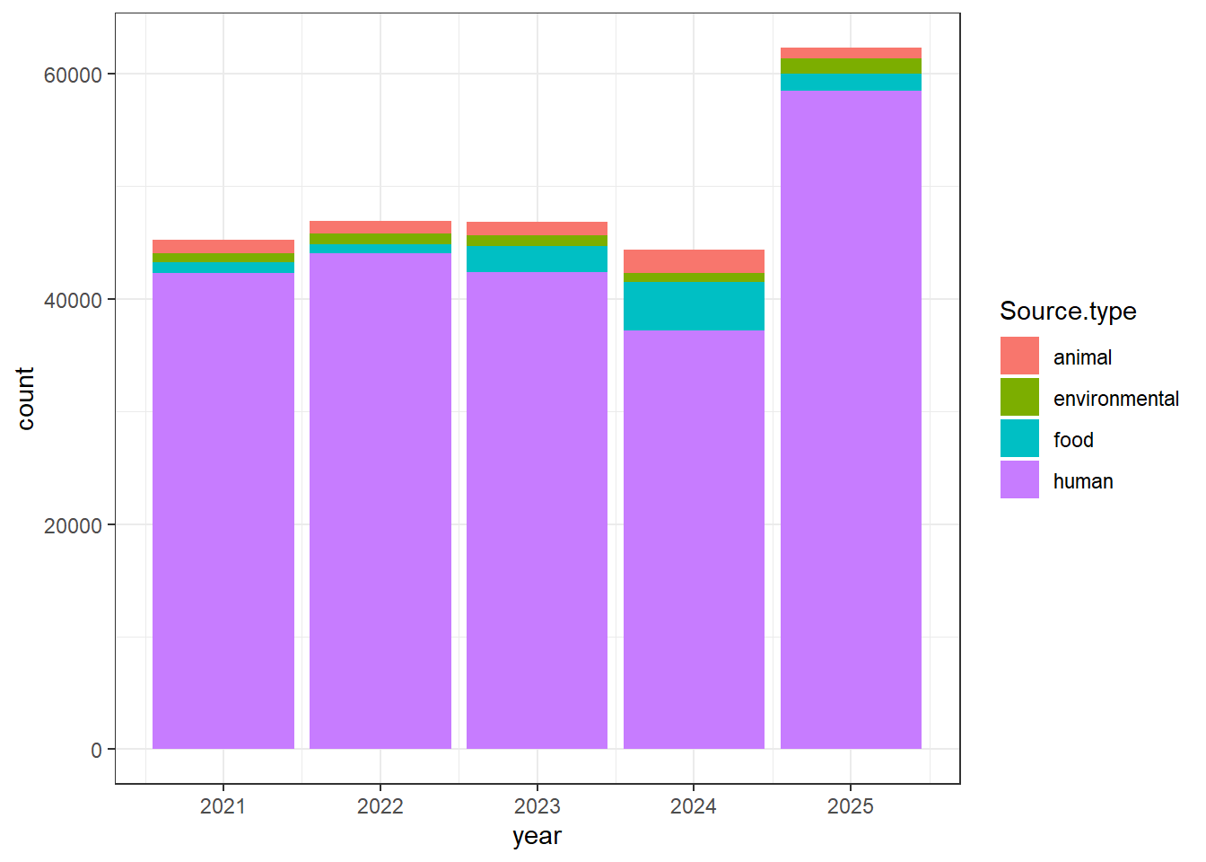
                        "Source.type"   =   isolates0$Source.type,
                        "BioSample" =   isolates0$BioSample,
                        "AMR.genotypes" =   isolates0$AMR.genotypes,
                        "Computed.types"    =   isolates0$Computed.types
)

#Identifying country names where isolates came from to NCBI
isolates1$country_name <- country_name(x= isolates1$Location, to="ISO3")

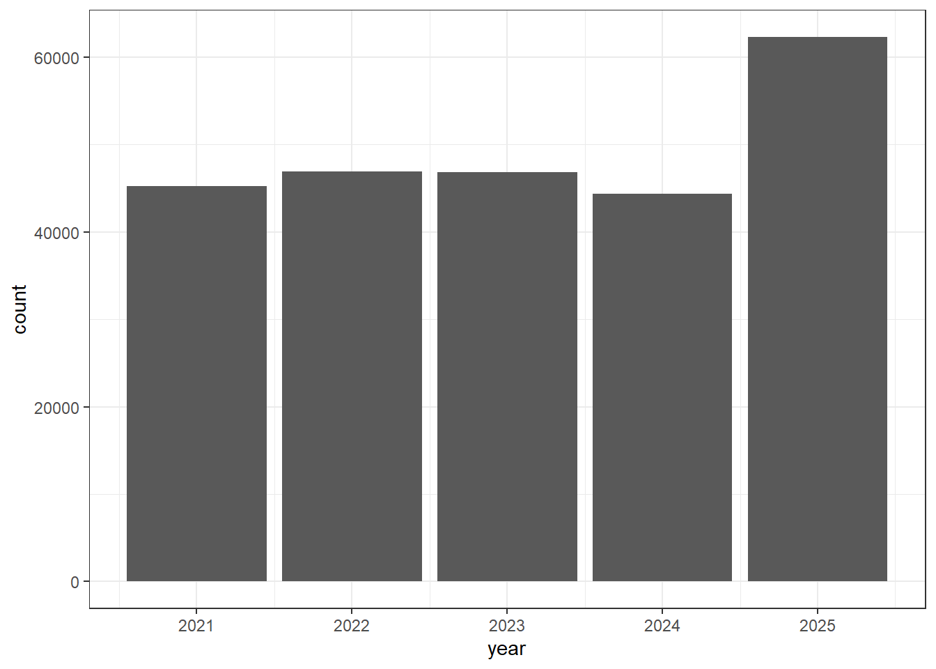
#Subsetting only for isolates obtained in the USA in the last 5 complete years
isolates1 <- isolates1[(isolates1$country_name %in% "USA"), ]

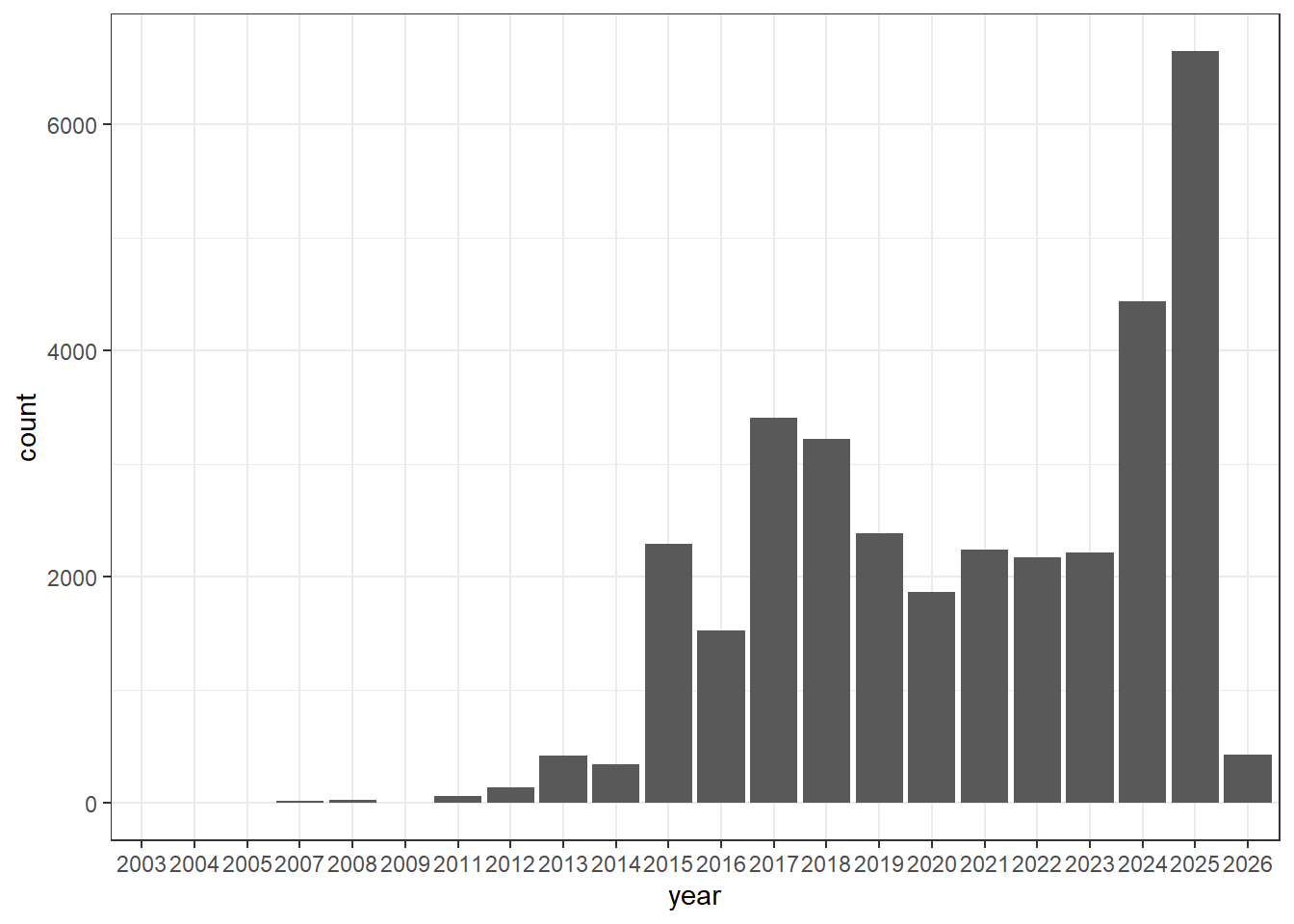
isolates1$year <-  as.numeric(substr(isolates1$Create.date, 1, 4))

isolates1 <- isolates1[(isolates1$year %in% c(2025, 2024, 2023, 2022, 2021)), ]

#Obtaining only categories of interest
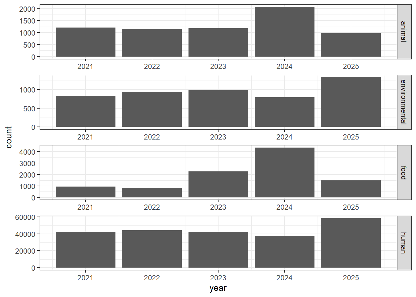
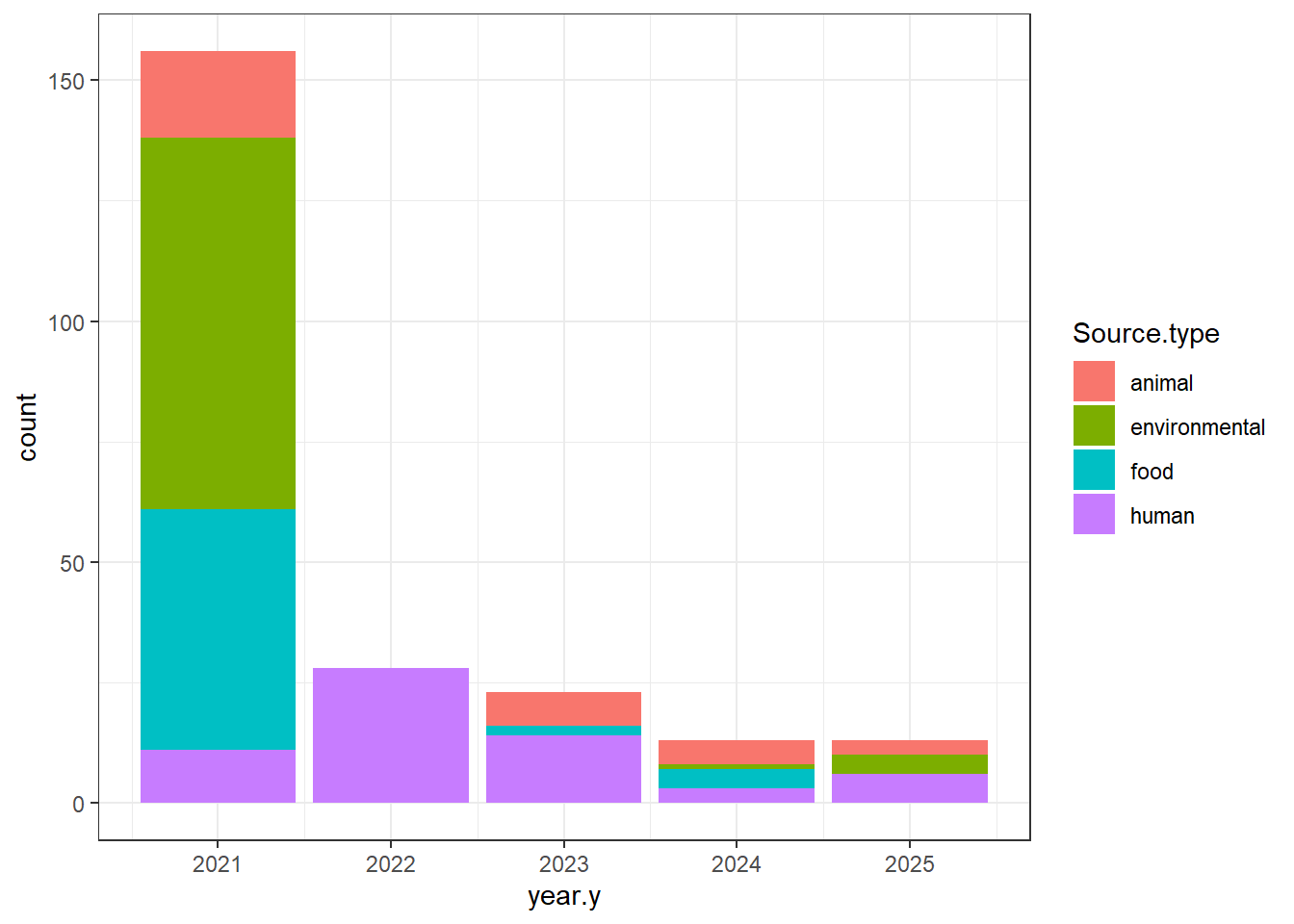
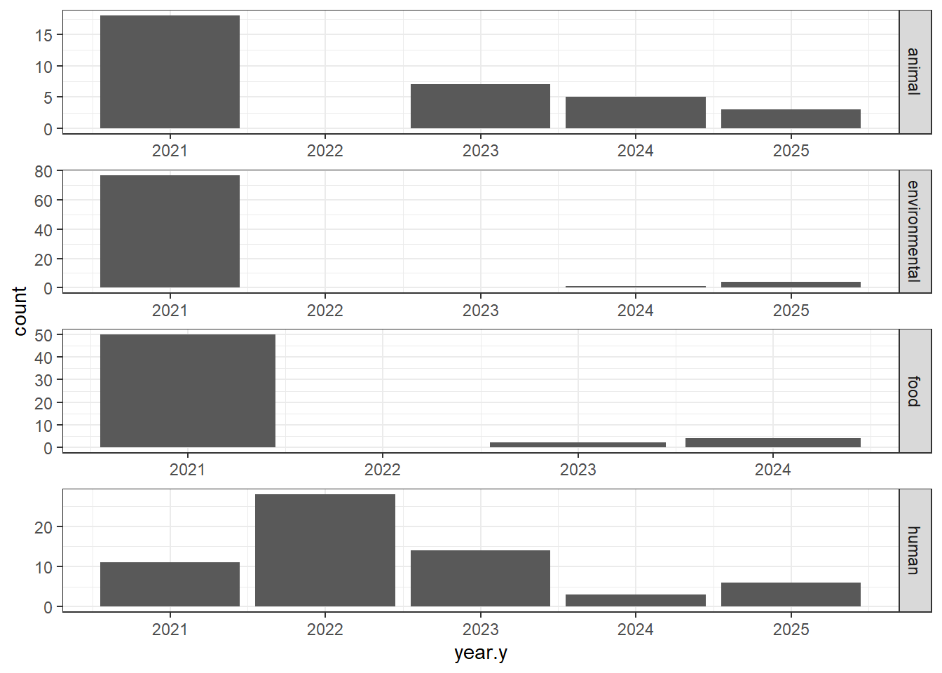
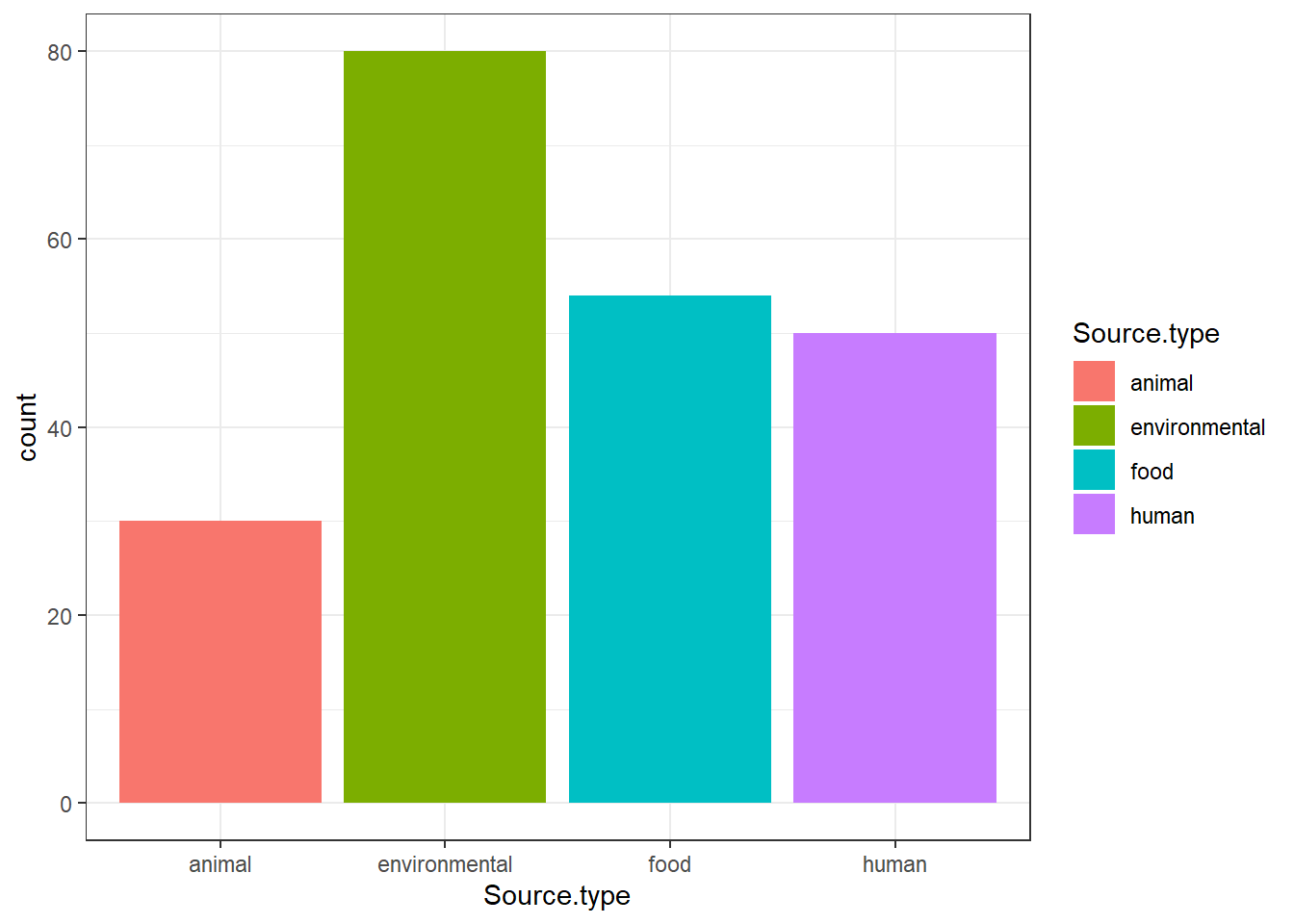
isolates1 <- isolates1[(isolates1$Source.type %in% c("animal", "environmental", "food", "human")), ]

#Saving new df, file under 100 MB
write_csv(isolates1, here("data/processed-data/", "isolates1.csv"))

#Selected colums for genomes dataframe
genomes0$genus <-  substr(genomes0$Organism.Name, 1, 10)

genomes1 <- data.frame("Annotation.Release.Date" = genomes0$Annotation.Release.Date,
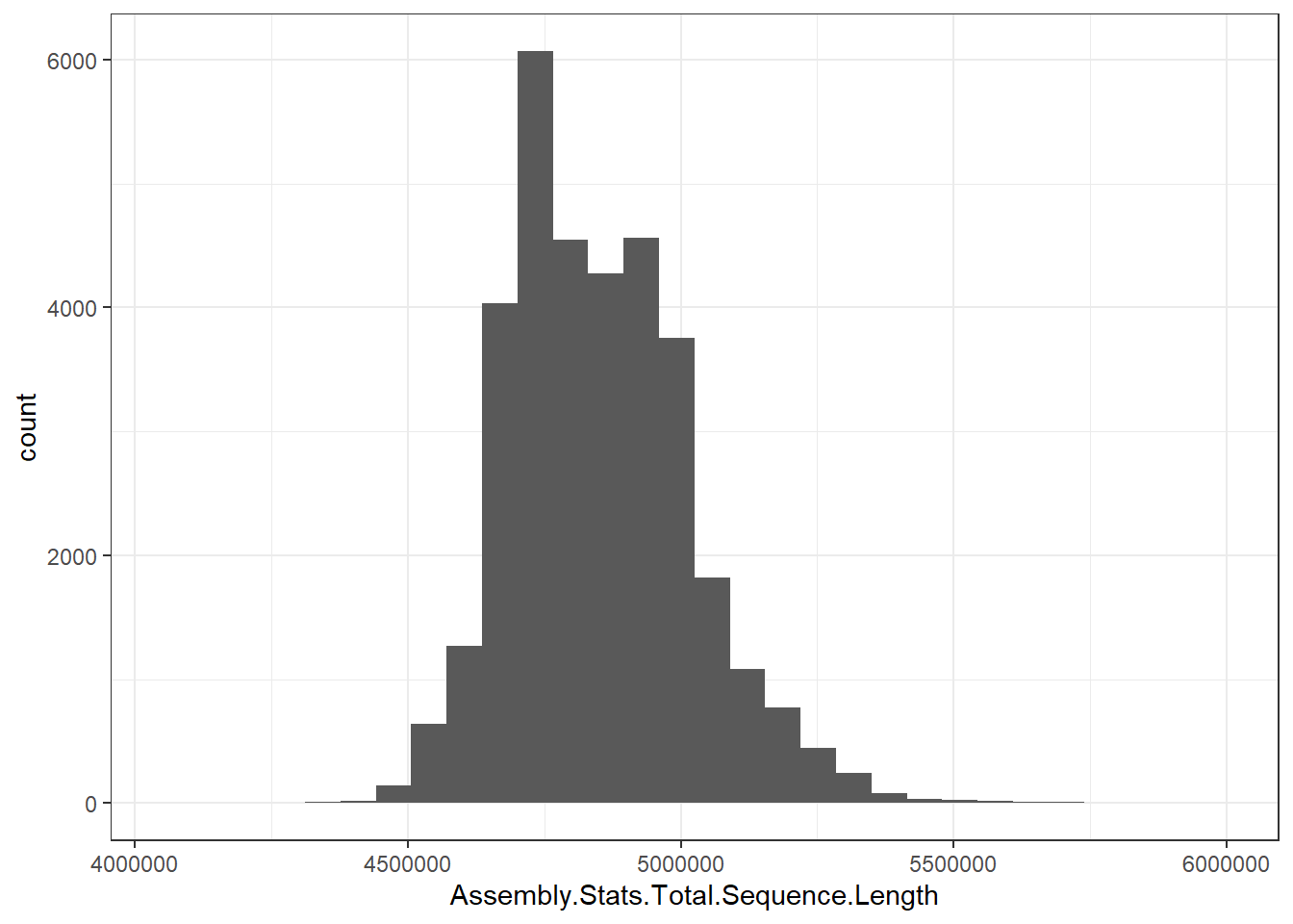
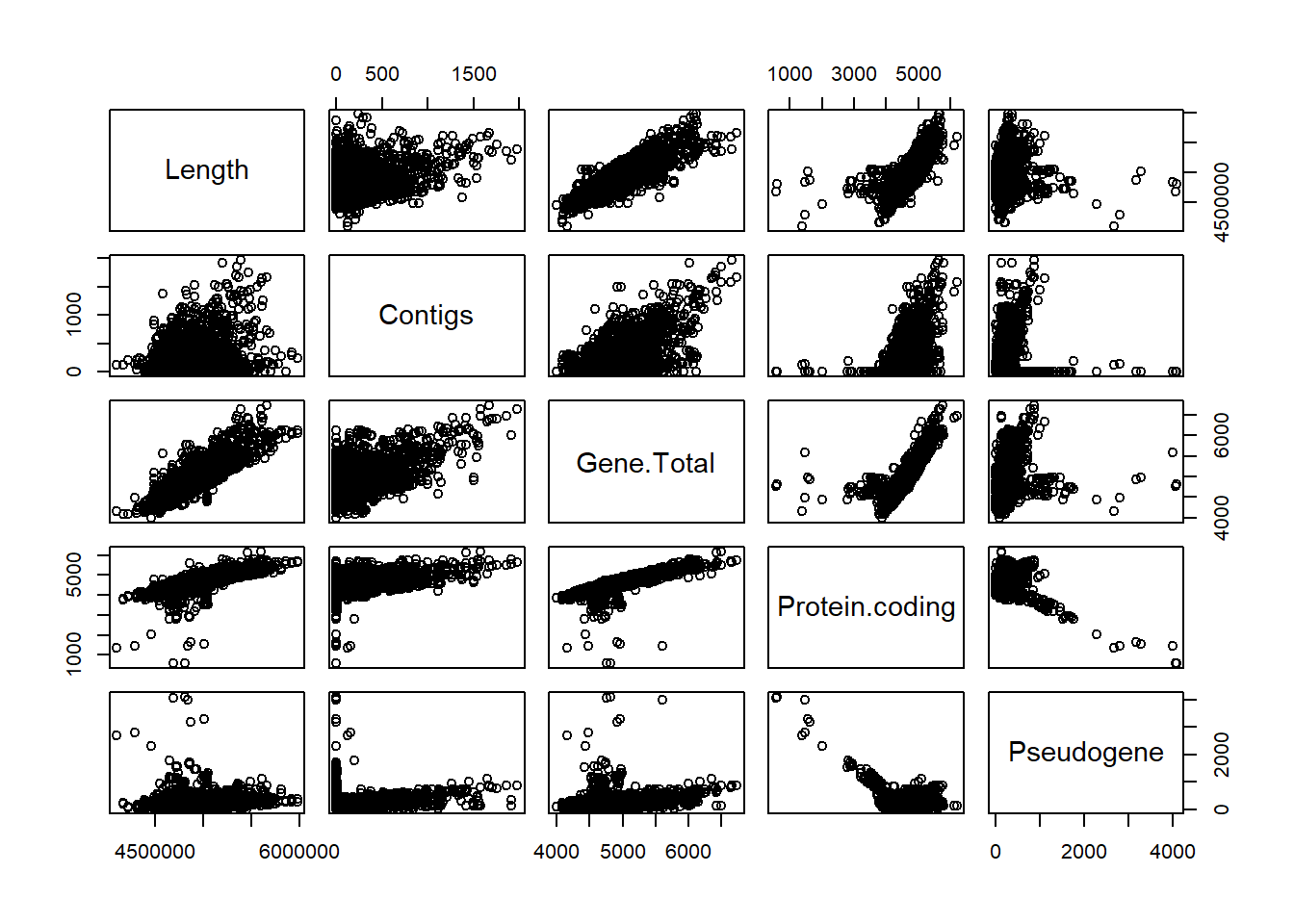
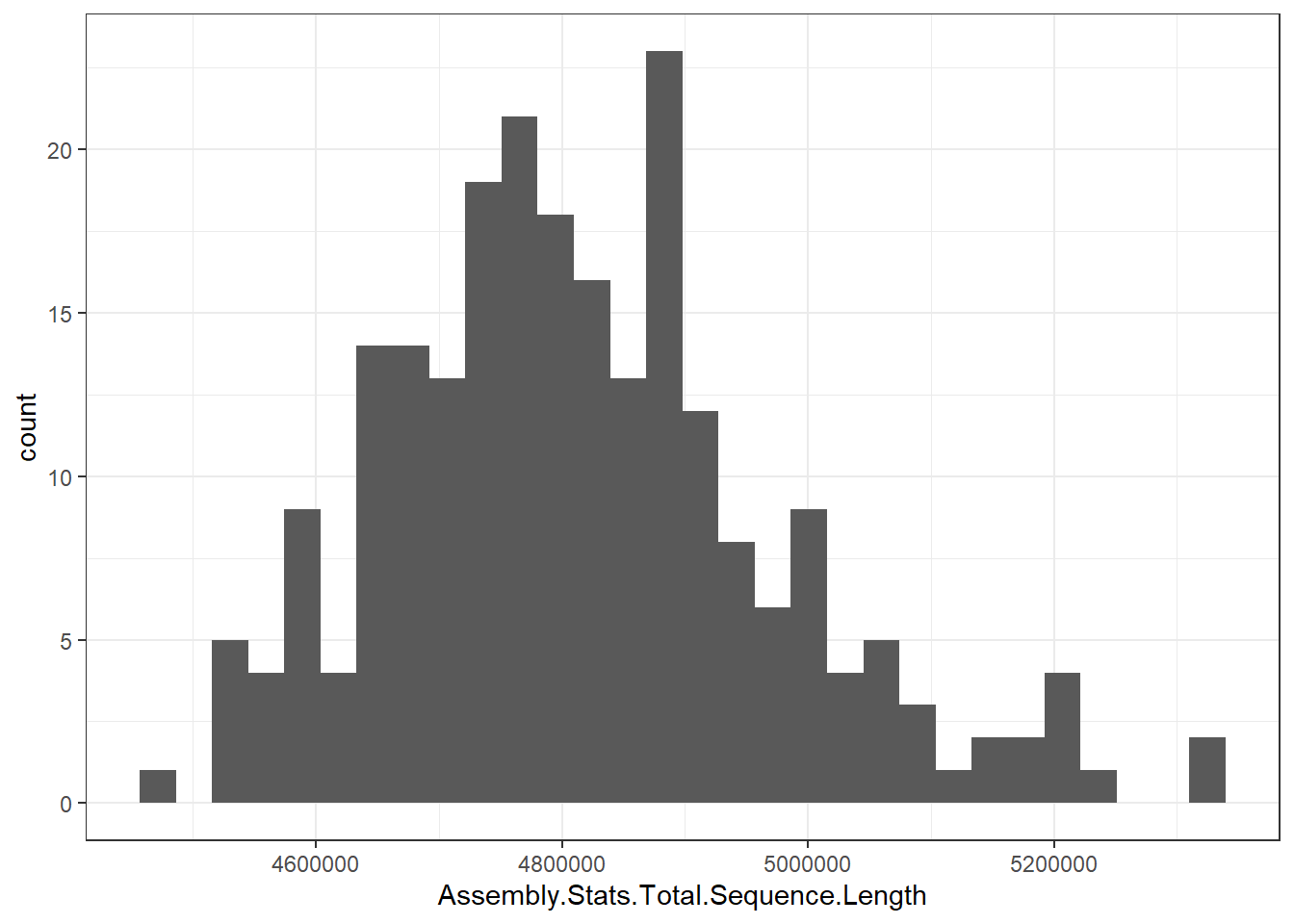
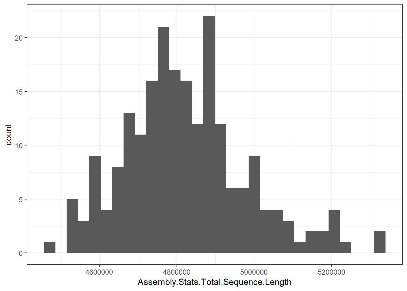
                        "Assembly.Stats.Total.Sequence.Length" = genomes0$Assembly.Stats.Total.Sequence.Length,
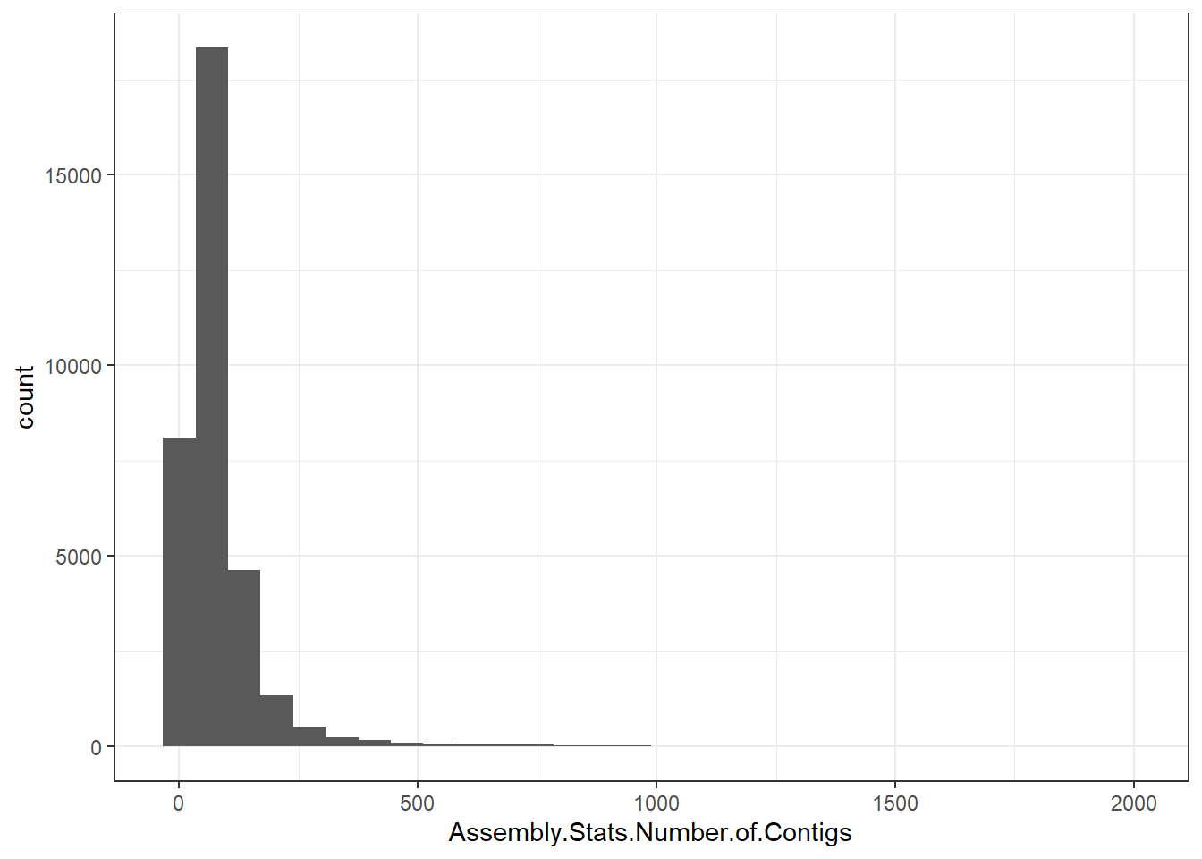
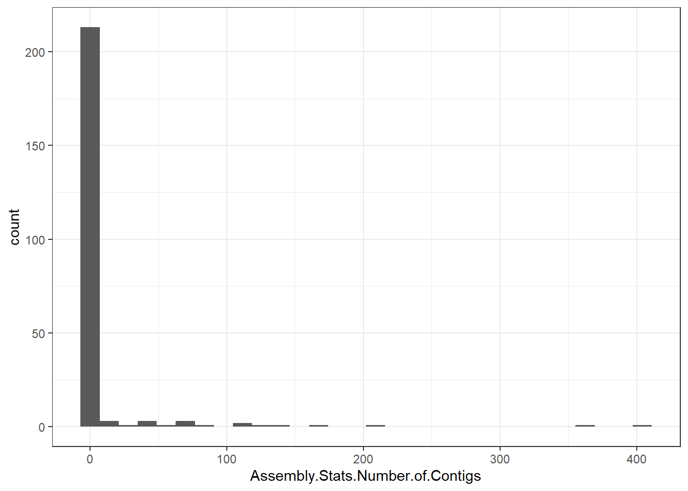
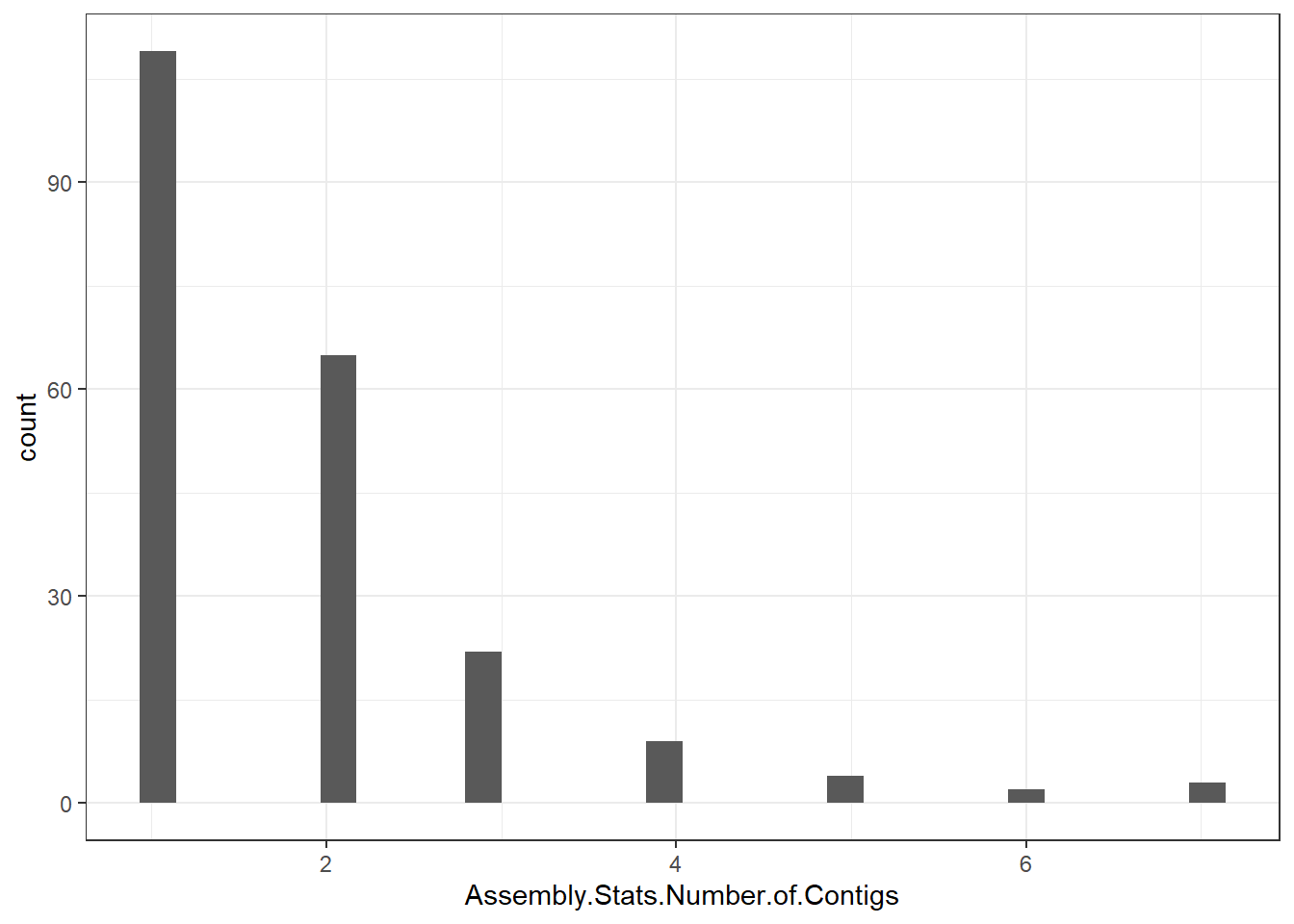
                        "Assembly.Stats.Number.of.Contigs" = genomes0$Assembly.Stats.Number.of.Contigs,
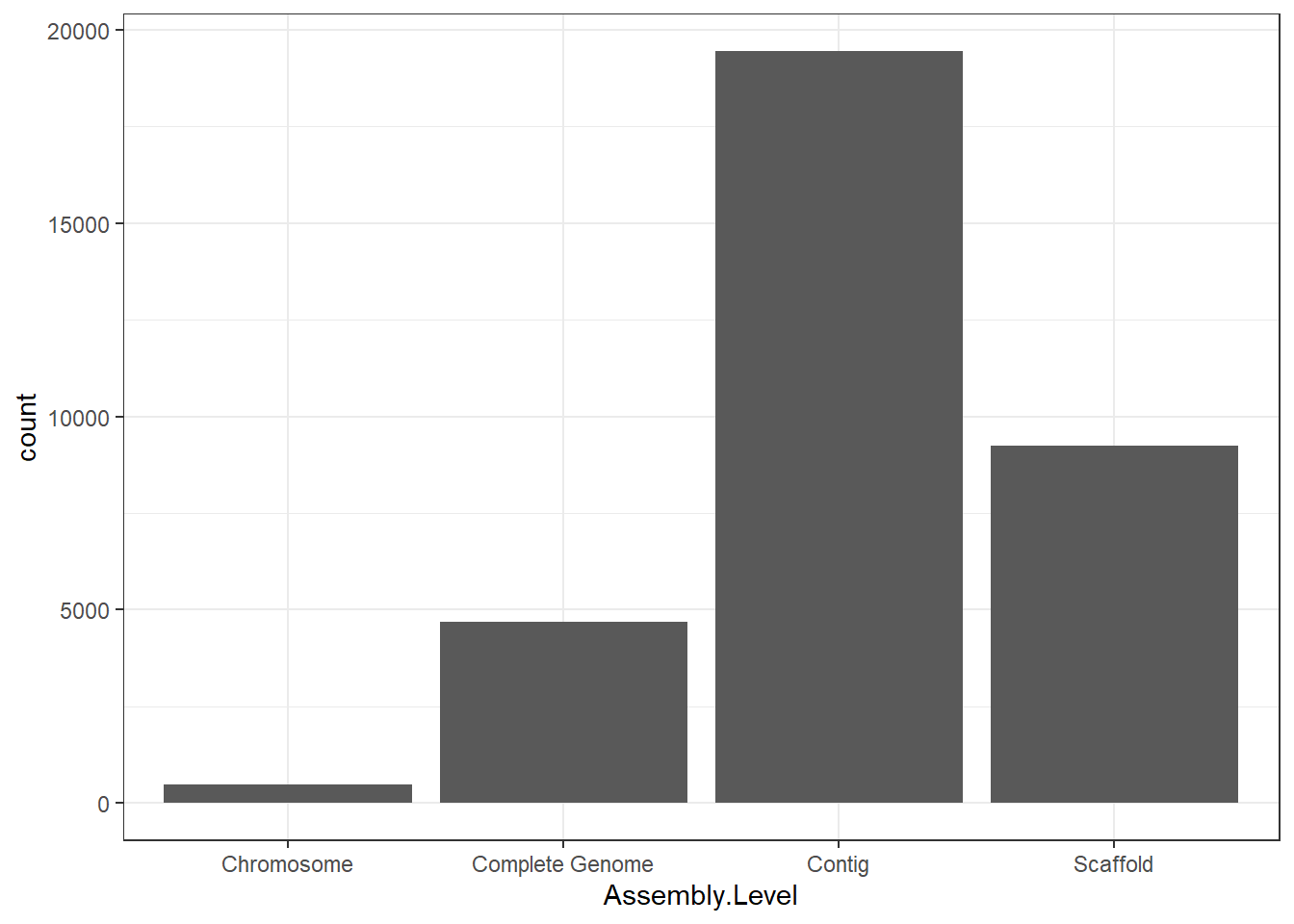
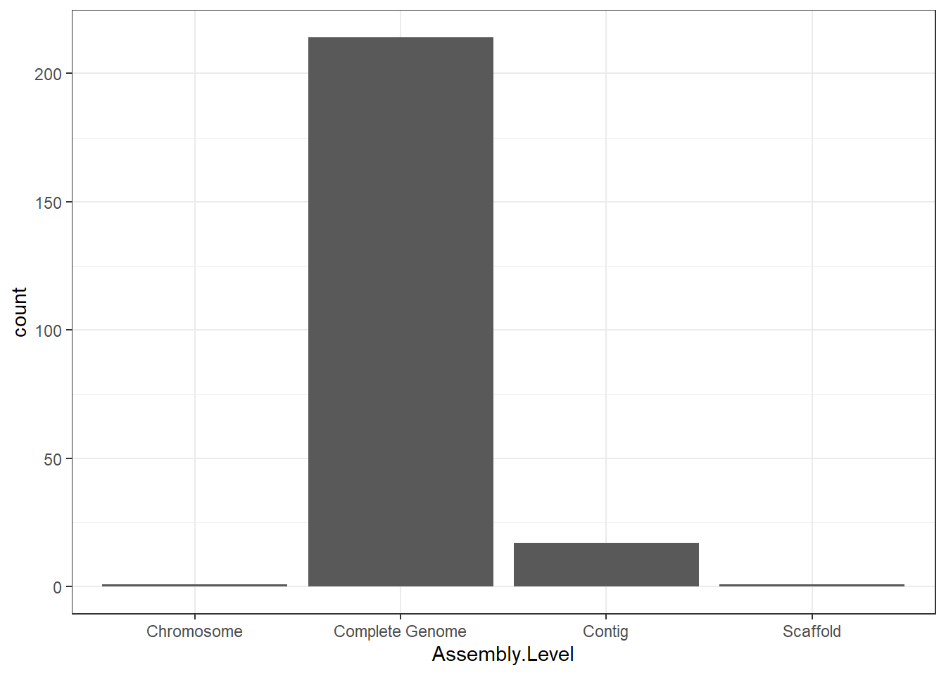
                        "Assembly.Level" = genomes0$Assembly.Level,
                        "Assembly.Release.Date" = genomes0$Assembly.Release.Date,
                        "BioSample" = genomes0$BioSample,
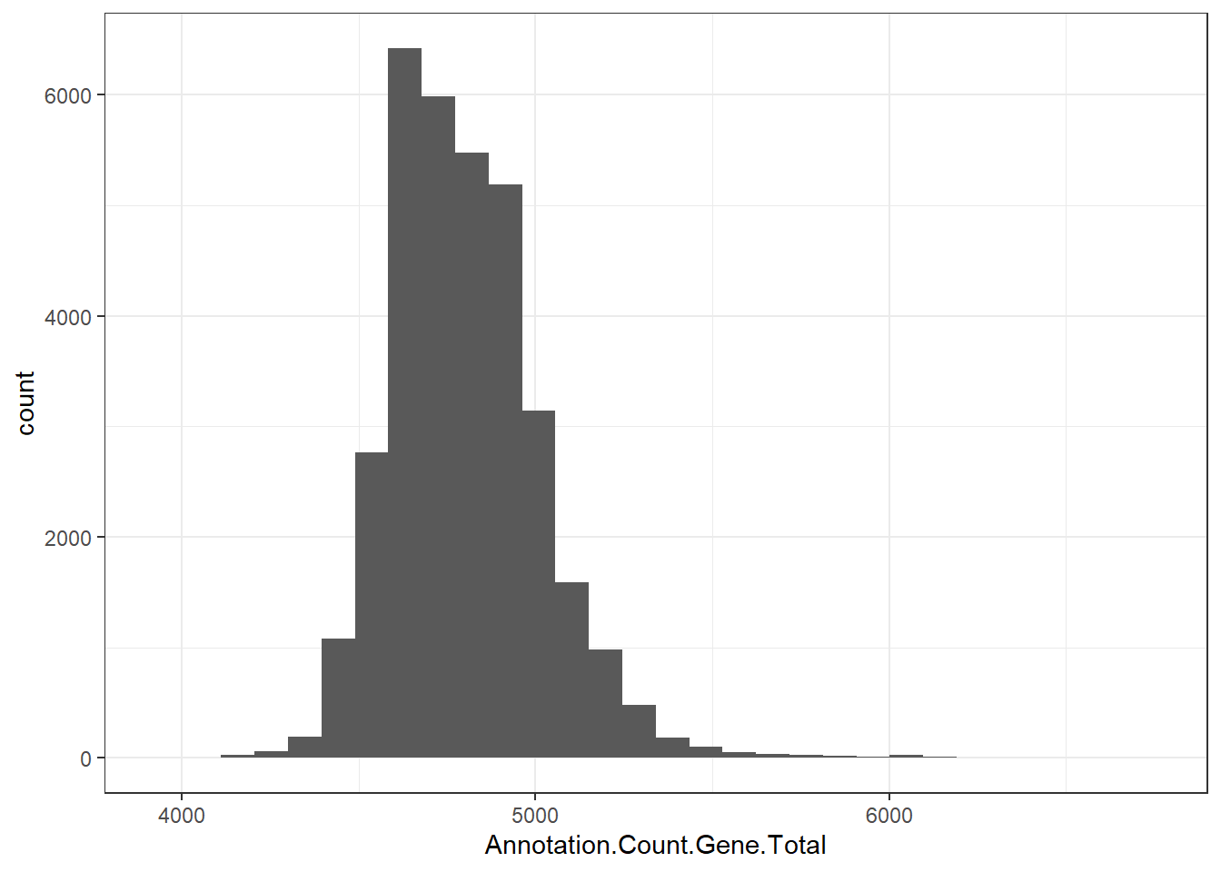
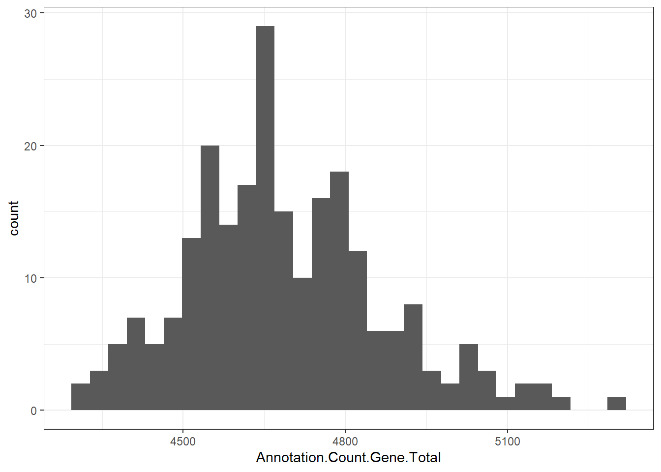
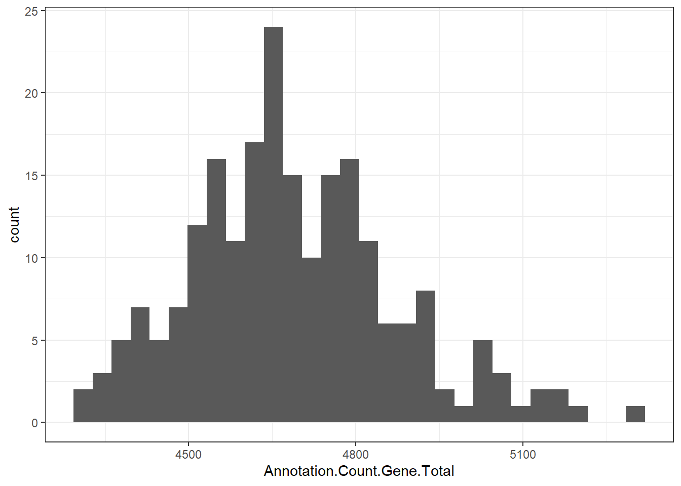
                        "Annotation.Count.Gene.Total" = genomes0$Annotation.Count.Gene.Total,
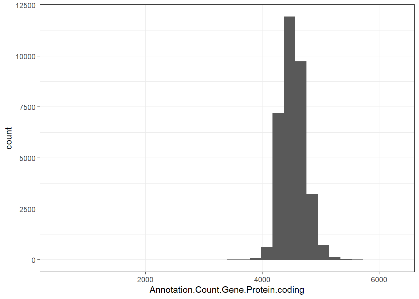
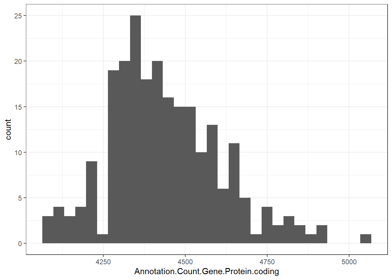
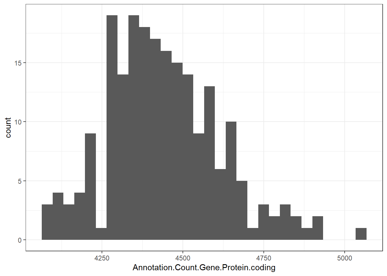
                        "Annotation.Count.Gene.Protein.coding" = genomes0$Annotation.Count.Gene.Protein.coding,
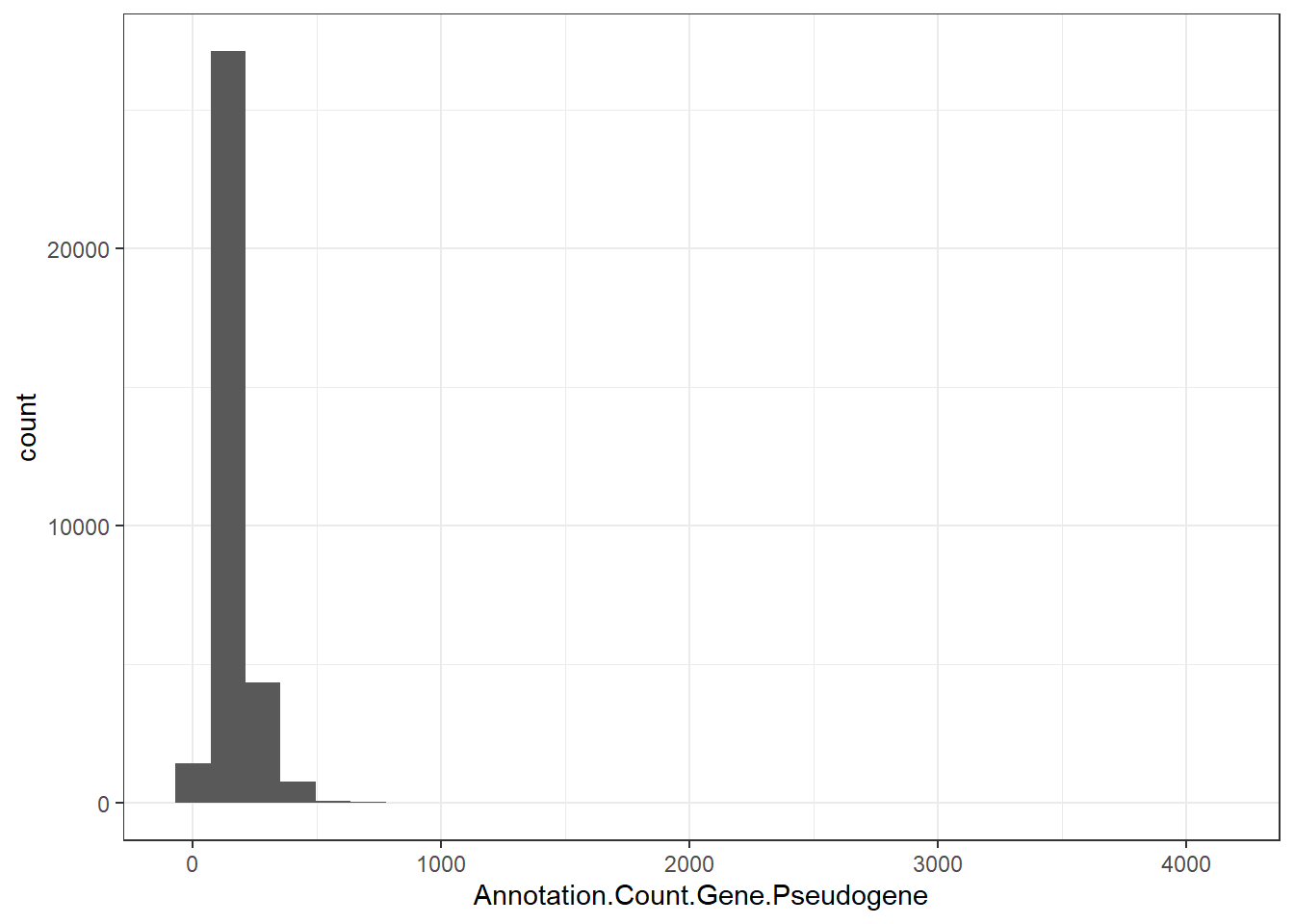
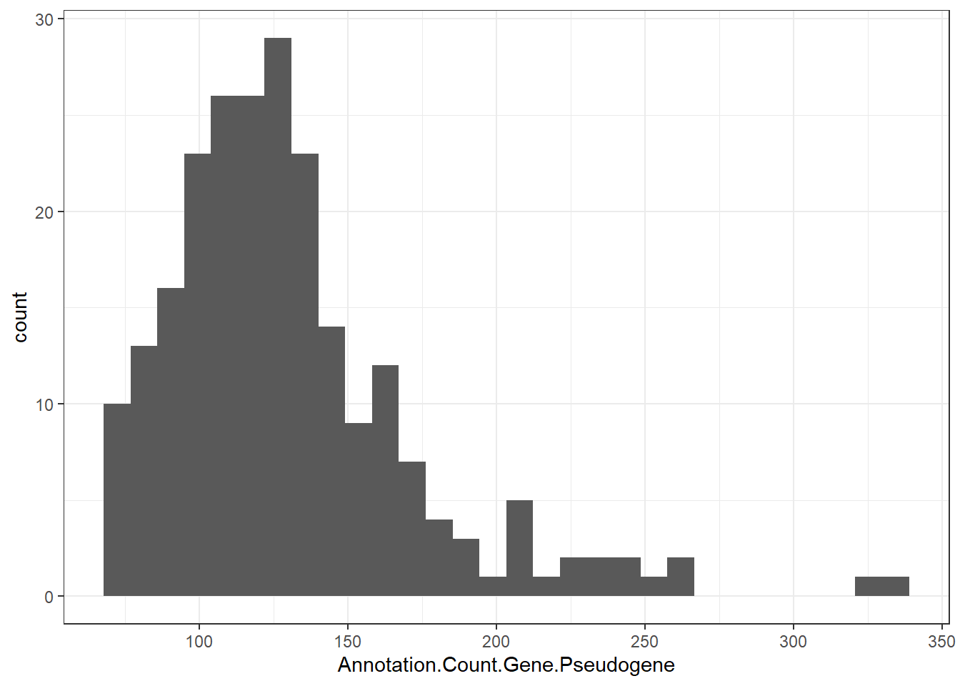
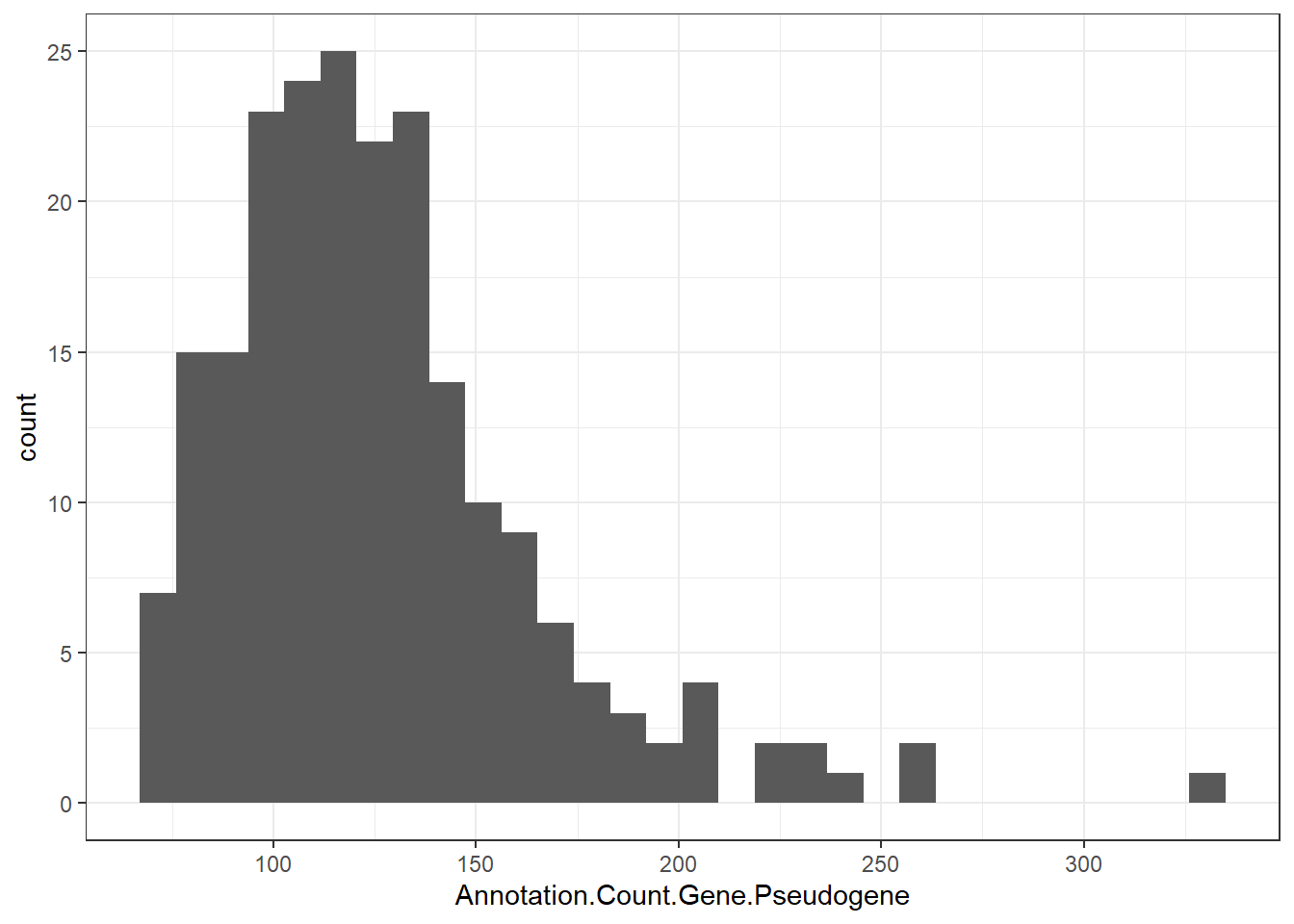
                        "Annotation.Count.Gene.Pseudogene" = genomes0$Annotation.Count.Gene.Pseudogene,
                        "genus" = genomes0$genus 
)

genomes1 <- genomes1[(genomes1$genus %in% "Salmonella"), ]

genomes1 <- na.omit(genomes1)

write_csv(genomes1, here("data/processed-data/", "genomes1.csv"))

After creating files for use

EDA EXECUTABLE CODE STARTS HERE:

#Load files created
isolates1 <- read.csv(here("data/processed-data/", "isolates1.csv"))
genomes1 <- read.csv(here("data/processed-data/", "genomes1.csv"))

Exploring first dataset: isolates1.csv

Data comes from progam of Pathogen Detection from NCBI
# Observing if there is any trend in the years the isolates were obtained
ggplot(isolates1, aes(x = year)) + geom_bar() + theme_bw()

# Observing trends main within isolates
ggplot(isolates1, aes(x = year, fill = Source.type)) + geom_bar() + theme_bw()

ggsave(filename = "isolatesgraph1.png", path = here("results/figures/"))
Saving 7 x 5 in image
ggplot(isolates1, aes(x = year)) + geom_bar() + facet_wrap(~ Source.type, scales = "free", ncol = 1, strip.position = "right") + theme_bw()

# Create summary table with counts and percentages
isolates1_summary_table <- isolates1 %>%
  group_by(Source.type, year) %>%
  summarise(n = n(), .groups = "drop") %>%
  group_by(year) %>%
  mutate(
    percent = round(n / sum(n) * 100, 1),
  ) %>%
  ungroup() %>%
  arrange(Source.type, year)

# Print table
print(isolates1_summary_table)
# A tibble: 20 × 4
   Source.type    year     n percent
   <chr>         <int> <int>   <dbl>
 1 animal         2021  1209     2.7
 2 animal         2022  1149     2.4
 3 animal         2023  1187     2.5
 4 animal         2024  2071     4.7
 5 animal         2025   977     1.6
 6 environmental  2021   825     1.8
 7 environmental  2022   938     2  
 8 environmental  2023   975     2.1
 9 environmental  2024   791     1.8
10 environmental  2025  1326     2.1
11 food           2021   938     2.1
12 food           2022   833     1.8
13 food           2023  2275     4.9
14 food           2024  4359     9.8
15 food           2025  1500     2.4
16 human          2021 42314    93.4
17 human          2022 44015    93.8
18 human          2023 42417    90.5
19 human          2024 37171    83.7
20 human          2025 58502    93.9
From this first dataset, the majority of isolates obtained from Pathogen detection come from human sources. This indicates that the majority of the data presented in this database will come from clinical cases. A minimnal number of (<10%) comes from other sources like animal, food, and enviromental.
#Now let's take a look if AMR is predicted for these isolates
isolates1$AMR_predicted <- !is.na(isolates1$AMR.genotypes)

#Graphic version of predicted AMR
ggplot(isolates1, aes(x = year, fill = AMR_predicted)) + geom_bar() + facet_wrap(~ Source.type, scales = "free", ncol = 1, strip.position = "right") + theme_bw()

ggsave(filename = "isolatesgraph2.png", path = here("results/figures/"))
Saving 7 x 5 in image
From this information we can observe that the majority of isolates are predicted to have AMR genes (~97.3%). This will be explored in the Descriptive analysis.

Exploring second dataset: genomes1.csv

Data comes from Datasets by NIH, this dataset is not part of any surveillance program. However, I am choosing to use this second database because it contains information about genome structure. While Pathogen Detection has predicted AMR and sources. Therefore both databases could complement each other once they are intersected.
#Substracting year of release date
genomes1$year <- as.character(substr(genomes1$Assembly.Release.Date , 1, 4))

#Observing trends main within genomes
ggplot(genomes1, aes(x = year)) + geom_bar() + theme_bw()

#Trends of available genomes from the last 5 complete years
# genomes2 <- genomes1[(genomes1$year %in% c(2025, 2024, 2023, 2022, 2021)), ]
# ggplot(genomes2, aes(x = year)) + geom_bar() + theme_bw()

#Histograms for all rest of the parameters based on genome structure
ggplot(genomes1, aes(x = Assembly.Stats.Total.Sequence.Length)) + geom_histogram() + theme_bw()
`stat_bin()` using `bins = 30`. Pick better value with `binwidth`.

ggplot(genomes1, aes(x = Assembly.Stats.Number.of.Contigs)) + geom_histogram() + theme_bw()
`stat_bin()` using `bins = 30`. Pick better value with `binwidth`.

ggplot(genomes1, aes(x = Annotation.Count.Gene.Total)) + geom_histogram()+ theme_bw()
`stat_bin()` using `bins = 30`. Pick better value with `binwidth`.

ggplot(genomes1, aes(x = Annotation.Count.Gene.Protein.coding)) + geom_histogram() + theme_bw()
`stat_bin()` using `bins = 30`. Pick better value with `binwidth`.

ggplot(genomes1, aes(x = Annotation.Count.Gene.Pseudogene)) + geom_histogram() + theme_bw()
`stat_bin()` using `bins = 30`. Pick better value with `binwidth`.

ggplot(genomes1, aes(x = Assembly.Level)) + geom_bar() + theme_bw()

From this information it can be observed that the majority of paramaters resemble a normal distribution, with some of them being skewed either left or right. Now let’s explore how they relate with each other. Year in Genomes Datasets do not correspond to the year in Pathogen Detection. Therefore, genomes will not be filtered by year.
#dataframe only with numeric values
genomes1_pairs_comp <- data.frame(
  "Length" = genomes1$Assembly.Stats.Total.Sequence.Length,
  "Contigs" = genomes1$Assembly.Stats.Number.of.Contigs,
  "Gene.Total" = genomes1$Annotation.Count.Gene.Total,
  "Protein.coding" = genomes1$Annotation.Count.Gene.Protein.coding,
  "Pseudogene" = genomes1$Annotation.Count.Gene.Pseudogene
)
pairs(genomes1_pairs_comp)

cor(genomes1_pairs_comp)
                   Length   Contigs Gene.Total Protein.coding  Pseudogene
Length         1.00000000 0.1803756  0.8964753      0.8576320  0.02604389
Contigs        0.18037555 1.0000000  0.4058947      0.3059128  0.22599285
Gene.Total     0.89647535 0.4058947  1.0000000      0.8981220  0.17087654
Protein.coding 0.85763199 0.3059128  0.8981220      1.0000000 -0.27272843
Pseudogene     0.02604389 0.2259928  0.1708765     -0.2727284  1.00000000
As expected, sequence length seems to be highly correlated with total of genes and total of protein coding genes. However, it is interesting to note that pseudogenes are not correlated with sequence length or any other of the tested parameters. This will be further explored later.

Merging both dataframes to assign sources, AMR genotype, and computed serovar

#First merge based on BioSample column only samples that intersect in both databases
merged_df0 <- inner_join(genomes1, isolates1, relationship = "many-to-many",  keep = FALSE, by = "BioSample")

#Only 197 rows match between genomes and isolates
merged_df0 <- merged_df0 %>% 
  mutate(Annotation.Release.Date = as.Date(Annotation.Release.Date))

#Removing repeated observations as they are several annotations dates, filtered by newer
merged_df1 <- merged_df0 %>% 
  group_by(BioSample) %>% 
  filter(Annotation.Release.Date== max(Annotation.Release.Date, na.rm = TRUE)) %>% 
  ungroup()

#Saving file
write_csv(merged_df1, here("data/processed-data/", "merged_df1.csv"))

Exploring merged_df1.csv

#Now repeating the previous exploration, but applied to the shared items between both databases

ggplot(merged_df1, aes(x = year.y, fill = Source.type)) + geom_bar() + theme_bw() # Year based on Pathogen Detection

ggplot(merged_df1, aes(x = year.y)) + geom_bar() + facet_wrap(~ Source.type, scales = "free", ncol = 1, strip.position = "right") + theme_bw() # Year based on Pathogen Detection

ggplot(merged_df1, aes(x = Assembly.Stats.Total.Sequence.Length)) + geom_histogram() + theme_bw()
`stat_bin()` using `bins = 30`. Pick better value with `binwidth`.

ggplot(merged_df1, aes(x = Assembly.Stats.Number.of.Contigs)) + geom_histogram() + theme_bw()
`stat_bin()` using `bins = 30`. Pick better value with `binwidth`.

ggplot(merged_df1, aes(x = Annotation.Count.Gene.Total)) + geom_histogram() + theme_bw()
`stat_bin()` using `bins = 30`. Pick better value with `binwidth`.

ggplot(merged_df1, aes(x = Annotation.Count.Gene.Protein.coding)) + geom_histogram() + theme_bw()
`stat_bin()` using `bins = 30`. Pick better value with `binwidth`.

ggplot(merged_df1, aes(x = Annotation.Count.Gene.Pseudogene)) + geom_histogram() + theme_bw()
`stat_bin()` using `bins = 30`. Pick better value with `binwidth`.

ggplot(merged_df1, aes(x = Assembly.Level)) + geom_bar() + theme_bw()

From this information we can observe that the majority of the intersecting items are completed genomes, which is actually helpful for us to analyze genome structure. We can also observe that 2021 is overrepresented, this is ok, as it might just represent a delay in the incorporation from Pathogen Detection to Datasets. I will be filtering by complete genomes, as some of items showed to be over 50 contigs (not good).
#Filtering by only complete genomes
merged_df2 <- merged_df1[(merged_df1$Assembly.Level %in% "Complete Genome"), ]

#Repeating exploration one more time
ggplot(merged_df2, aes(x = Source.type, fill = Source.type)) + geom_bar() + theme_bw()

ggsave(filename = "genomesgraph1.png", path = here("results/figures/"))
Saving 7 x 5 in image
ggplot(merged_df2, aes(x = Assembly.Stats.Total.Sequence.Length)) + geom_histogram() + theme_bw()
`stat_bin()` using `bins = 30`. Pick better value with `binwidth`.

ggplot(merged_df2, aes(x = Assembly.Stats.Number.of.Contigs)) + geom_histogram() + theme_bw()
`stat_bin()` using `bins = 30`. Pick better value with `binwidth`.

ggplot(merged_df2, aes(x = Annotation.Count.Gene.Total)) + geom_histogram() + theme_bw()
`stat_bin()` using `bins = 30`. Pick better value with `binwidth`.

ggplot(merged_df2, aes(x = Annotation.Count.Gene.Protein.coding)) + geom_histogram() + theme_bw()
`stat_bin()` using `bins = 30`. Pick better value with `binwidth`.

ggplot(merged_df2, aes(x = Annotation.Count.Gene.Pseudogene)) + geom_histogram() + theme_bw()
`stat_bin()` using `bins = 30`. Pick better value with `binwidth`.

214 genomes are complete and intersect between both datasets. These will be use only to assess genome structure. Isolates1 will be use to assess AMR genotypes.

Saving tables and figures for manusctript

library(gt)

# Reshape the data to wide format
isolates_wide <- isolates1_summary_table %>%
  mutate(display_val = paste0(scales::comma(n), " (", percent, "%)")) %>%
  select(Source.type, year, display_val) %>%
  pivot_wider(names_from = year, values_from = display_val)

# Create the table with 'shrink-to-fit' width
isolates_wide %>%
  gt() %>%
  tab_header(
    title = "Salmonella Isolate Distribution (2021-2025)",
    subtitle = "Annual counts and relative percentages by source type"
  ) %>%
  tab_spanner(
    label = "Yearly Distribution [Count (%)]",
    columns = -Source.type
  ) %>%
  cols_label(
    Source.type = "Source Type"
  ) %>%
  tab_source_note(
    source_note = "Data source: NCBI Pathogen Detection Database."
  ) %>%
  opt_stylize(style = 1, color = "gray") %>%
  tab_options(
    table.width = NULL, 
    column_labels.font.weight = "bold",
    table.align = "center" 
  ) %>%
  saveRDS(here("results/tables/isolates1_summary_table_wide.rds"))


cor_matrix <- cor(genomes1_pairs_comp) %>% 
  as.data.frame() %>% 
  mutate(Variable = rownames(.)) %>%
  select(Variable, everything())

cor_matrix %>%
  gt() %>%
  tab_header(
    title = "Correlation Matrix of Genomic Features",
    subtitle = "Pearson correlation coefficients (r) for Salmonella genomes"
  ) %>%
  fmt_number(columns = -Variable, decimals = 3) %>%
  data_color(
    columns = -Variable,
    palette = "RdBu",       # Changed to Red-Blue to show negative/positive correlations
    domain = c(-1, 1)       # Expanded domain to catch negative values
  ) %>%
  cols_label(
    Variable = "Genomic Feature",
    Protein.coding = "Protein Coding",
    Gene.Total = "Total Genes"
  ) %>%
  tab_footnote(
    footnote = "Note the low correlation between Pseudogenes and other features.",
    locations = cells_column_labels(columns = Pseudogene)
  ) %>% # Moved the pipe outside the locations function
  saveRDS(here("results/tables/cor_matrix.rds"))
library(ggplot2)
library(here)
library(scales)

Attaching package: 'scales'
The following object is masked from 'package:readr':

    col_factor
# Standardized Theme for all plots
pub_theme <- theme_bw() + 
  theme(
    panel.grid.minor = element_blank(),
    plot.title = element_text(face = "bold", size = 14),
    axis.title = element_text(face = "bold"),
    strip.background = element_rect(fill = "gray95"),
    strip.text = element_text(face = "bold")
  )

# --- ISOLATES GRAPH 1: Distribution by Year and Source ---
# Using a stacked bar with a clean color palette
ggplot(isolates1, aes(x = factor(year), fill = Source.type)) +
  geom_bar(position = "stack") +
  scale_fill_viridis_d(option = "mako", name = "Source Type") +
  labs(
    title = "Salmonella Isolate Trends (2021-2025)",
    x = "Year of Collection",
    y = "Number of Isolates"
  ) +
  pub_theme -> isolatesgraph1_pub

# --- ISOLATES GRAPH 2: Predicted AMR Faceted by Source ---
# Using consistent scales to allow for easier comparison
ggplot(isolates1, aes(x = factor(year), fill = AMR_predicted)) +
  geom_bar() +
  facet_wrap(~ Source.type, scales = "free_y", ncol = 2) +
  scale_fill_manual(values = c("gray70", "#D55E00"), name = "AMR Predicted") +
  labs(
    title = "AMR Prediction Across Sources",
    x = "Year",
    y = "Isolate Count"
  ) +
  pub_theme -> isolatesgraph2_pub

# --- GENOMES GRAPH 1: Summary of Complete Genomes ---
# Highlighting the specific subset used for structural analysis
ggplot(merged_df2, aes(x = Source.type, fill = Source.type)) +
  geom_bar(show.legend = FALSE) +
  scale_fill_brewer(palette = "Set2") +
  labs(
    title = "Source Distribution of Complete Genomes",
    subtitle = "Subset (n=214) used for genomic structure analysis",
    x = "Source Type",
    y = "Count"
  ) +
  pub_theme -> genomesgraph1_pub
# Saving Isolate Graph 1
ggsave(
  filename = "isolatesgraph1_pub.png",
  plot = isolatesgraph1_pub,
  path = here("results/figures/"),
  width = 8, height = 6, dpi = 300
)

# Saving Isolate Graph 2 (needs more height due to facets)
ggsave(
  filename = "isolatesgraph2_pub.png",
  plot = isolatesgraph2_pub,
  path = here("results/figures/"),
  width = 10, height = 8, dpi = 300
)

# Saving Genome Graph 1
ggsave(
  filename = "genomesgraph1_pub.png",
  plot = genomesgraph1_pub,
  path = here("results/figures/"),
  width = 7, height = 5, dpi = 300
)